“It’s a pretty big website for such a little screen.” This is what we told ourselves as we watched mobile devices access more of midpen.com.
 Early on, mobile device queries were just looking for the phone number, checking the evening hours, or getting directions. A quick pinch-and-zoom got them what they needed.
Over time (or maybe the introduction of more mobile device sizes) page queries began to change. The website, which was designed for desktop computers, looked too small on a mobile device. So, we shifted our priorities. Fun projects, like the ‘showcase and gallery’ project, would stay on the back burner in order to deliver the *useful* features of the desktop website to various and sundry mobile devices.
Crazy, right? Not really. First and foremost, technology should be used to make things easier for you — request an appointment, get a prescription refilled, grab a form to bring in filled out, or check out information about common topics.
When we got all that into a new version for mobile devices, tested up and pushed live, it felt pretty good. Now, people accessing the site from a desktop or laptop computer get the same site they always have, but people using mobile devices get a mobile-optimized version of the website. The appointment and refill requests forms work like mobile forms work.
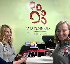
It should make things easier for you. And that makes us happy. See those big smiles? Those are happy smiles. To make it official, we decided a little ribbon cutting ceremony was in order. All around big smiles for a big website on such a little screen.
